My Visitors

Friday 26 September 2014

Expression of Aesthetic Judgment


Aesthetically these pieces are very different. Megan Duncanson (the top piece) has a whimsical element to her painting. Her strokes at the bottom are clean and smooth contrasting directly with the rest of the background which is short thick strokes. The tree is solid back standing out from the colourful background of blue, purple, red, and orange. The bulbs at the end of the tree are lighter shades accentuating the ends of the branches. However, the tree is thin slightly blending in with the dark background which I believe is the downfall of this piece.
Lawren Harris did the bottom piece. In my opinion it is a classic painting of the Ontario landscape. The trees are solid more subdued colours of dark orange and yellow, but the sky is a bright blue which reflects on the water giving the piece a classic Fall day vibe. This piece is more realistic making the trees look full and alive while Duncansons was more mystical.
Aesthetically, I personally believe Lawren Harris piece was more successful  because of his colour use, technique, and the eye-catching piece it is.

Consideration of Cultural Context

In this post I will be comparing the differences in cultural context between traditional and contemporary art. Traditional artists such as Lawren Harris pieces are mainly based off of traditional Canadian landscape and culture. Harris rarely did work based on other countries. This could be because it was harder to travel in the 1920's. So if Harris couldn't travel to international places he could not paint about them. Harris sat and viewed landscapes, and experienced them first-hand in order to create his master pieces. However, as technology has evolved now anyone could paint a picture of a place half way across the world by just "googling" it. Almost in a way contemporary artist have more freedom because they are not stuck experiencing one culture. Travel is much more convenient now so artist can travel the world. I also believe pieces now are made to prove a point or make a statement about the flaws within our present day culture.

Thursday 25 September 2014

Analysis & Interpretation Contemporary


For my contemporary art pieces I chose Megan Duncanson and Leonid Afremov. Both these pieces use bright vibrant colours thickly applied. Leonid Afremov takes realistic scenes, and often uses shades of blues, yellow, and pink. I chose some of his landscape pieces in order to compare to Lawren Harris. Afremov uses contrasting bright colours, he also has thin long brush stokes which are noticeable unlike Harris's paintings which normally are blended very well. Afremov is also an impressionist, and does a lot of portrait work as well, also unlike Harris who stuck to abstract and landscape. Afremov also did paintings based on cities all around the world especially Italy and Paris.The painting at the very top is by Megan Duncanson. I thought this piece would be a good example of a contemporary piece which included some nature element in order to compare to Harris.  Duncanson's work includes somewhat of a mystical element which traditional pieces did not have. She uses vibrant blues, oranges, and reds. The tree is unrealistic such as Harris's work, however her painting style includes short thick strokes in the middle and smooth lines towards the bottom. Overall, my analysis and interpretation of traditional vs. contemporary revealed that contemporary pieces often have an element of entertainment and romance.

Analysis & Interpretation Traditional Art


For traditional art I chose my favourite group of seven artist Lawrence Harris. His art is traditional to Canadian history. Harris's lines are clean, with few details. His colours normally range from darker blues, and green because most pieces focus on Canadian landscapes. Most pieces of Harris's are simplified however, Harris not only took an interest in landscapes but also expanded to abstract paintings. Although, his inspiration shifted his techniques remained in each painting. Few paintings include vibrant colours as Harris clearly favoured more subdued neutral shades for his abstract pieces. Even though, the abstract portion of his career was prominent it was the landscape pieces which helped him develop the style he is best known for. His pieces early in his career were seen as rich, and applied with think paint however, later in his career Harris became more simplified. In my own personal opinion I enjoy his landscape pieces rather than the abstract. I also enjoy pieces that include rich blue shades for the winter season, and fall leaf colours because it reminds me of Northern Ontario. Overall, the pieces above are some of my favourite art works of his.

Wednesday 24 September 2014

Pottery

Last Friday, I experimented with pottery. It was harder then I had expected. Pieces that interested me to start trying pottery are:


You have to always have a steady hand! Also, especially remember to keep putting your hands in the water to keep lubrication. I made both these mistakes and the result was very damaging to the pot. I was trying to make a pot with a larger base and a smaller top however, that is very hard! As soon as I began I regretted such a complicated design for my first try with the pottery wheel. Finally, I came to the conclusion that the pottery wheel session would the classified as "experimenting" because no final product ever came about. The biggest problem that kept occurring to me was the pot either the sides being uneven or the clay cracking. I figured if I couldn't be satisfied in the final product there was no use in wasting the clay. All in all I was happy I tried out the wheel, and next time I have decided to try to make small cups. These are some ideas: 


Thursday 18 September 2014

Class Question

Question: Is it important to have the right to choose your own materials? How does this help you as a student?... as an artist?

Answer: Yes, it is important to choose your materials because only you can know which materials work best with your strengths and weaknesses. However, you can also look at it in another way that been given materials forces you to play out of your comfort zone, and may unintentionally cause you to grow as an artist. This might be a good thing especially if you do not normally go out of your comfort zone, and might shed some light on new materials which you never even knew of.
An example of this would be somewhat of an experience I had in art class. I normally stick to paintbrushes and pastels but the basics just was not giving me the look I was going for so I was forced to try something new: cotton swabs. Surprisingly, they worked quite well, but I never would have knew there potential if I had not tried something new. I am now benefit with this new found knowledge and confidence to try new things as a student and an artist.

#niprockart Painting process

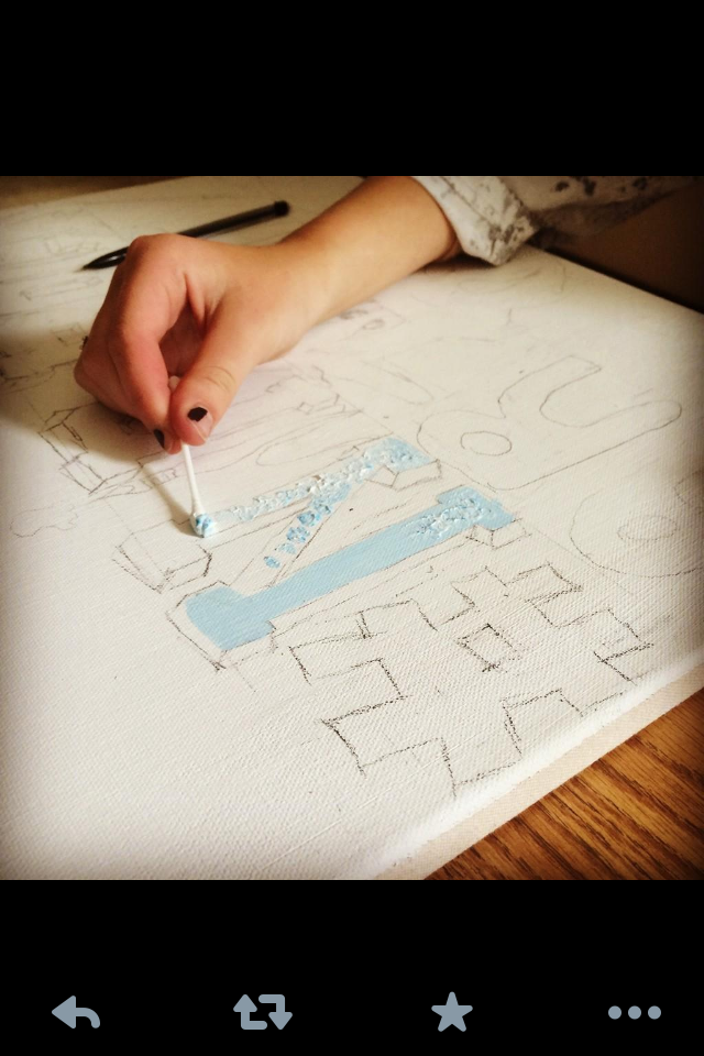
When I first started painting I wasn't positive as to what exact texture I was going for. However, I knew i wanted it to be a mix of blue and white. At first I attempted to play around with a paint brush, but I wasn't completely happy with the product so I started experimenting with other tools. I ended up using a cotton swab to paint all my letter fronts. I found it was the best to roll in the paint and then dab/roll onto the canvas. Some downfalls of the cotton swab was that painting took forever! With each letter I became less patient because I thought the painting would have been done much sooner. I did learn that experimenting can lead to utilizing the most unique tools.
Once I finally finished the letters I moved onto the paint palette and paint brush in the lower right corner. I struggle to find the right shade of brown for both pieces. I asked for advice and a fellow classmate suggested outlining the palette in black, but I am still am not very happy with how they look. 
Next, was the moose head. I first outlined the spots that would be black (nose, mouth, etc.). This was a mistake because it would have been much easier in the long run if i had painting the whole moose brown then the face. As a result the painting is not thick enough in some spots on the canvas. Another issue I had with the moose was the colour. I accidentally grabbed the wrong brown and it had a grey/green tone to it when I was hoping for more of a chocolate brown. I ask Mrs.Rose for help with a solution and she showed me colours to mix in order to make your own brown. Although, immediately after I found the correct brown it was an excellent learning experience.
Finally, I was finished but I didn't think it looked quite complete so I decided to paint the back round a light blue to tie the whole look together. Unfortunately, this was on a Friday and I ran out of class time, therefore when I returned on the Monday I mixed a new blue which was not quite the same as the original. However, I did not turn on the lights while I was painting and couldn't tell until I was finished. Now some parts are darker/lighter then others, but at this point I was to happy to be done no changes were done, and now I like to think the discoloration gives it some "character".  I enjoy painting, but next time I think i will opt for a smaller size canvas in order to prevent me getting bored and rushing.


Thursday 11 September 2014

Research Project: Initial Thoughts

My newest task in Grade 11 art is to compare traditional art to contemporary. I wanted to do a post prior to research to put my initial thoughts about the two.

In my mind I relate traditional art to paintings. Right away I think of portraits, battle scenes, etc. When thinking about traditional art I also picture statues such as the ones in Rome. Of course famous paintings come to mind such as Starry Night and The Mona Lisa, as well as legendary artists such as Van Gough and Leonardo Da Vinci. I think about the paintings on ceilings of churches, and traditional art museums and what they might hold. In my mind there are very few sculptures. When thinking of the traditional art paintings I believe many of the past were created to document an event or to tell a story. I think these thoughts share significant similarities and differences with contemporary art.

When thinking about contemporary art I picture abstract paintings, and  large upscale sculptures.It seems to me that like traditional art contemporary also shares a story. However, from initial thoughts it seems more art pieces in modern times were produced to make a statement rather then document and event.  I also realized I am very unaware of modern artists, and the most recent ones I know of are the members of The Group of Seven. I also am unaware of any new modern art galleries or pieces. I realized that I have more background knowledge and understanding of traditional art. However, the more I thought about it the more strange I realized it was that I a modern youth, who should connect with modern art, has no understanding what so ever. After thinking about it for some time I believe perspective is my issue. I have grown up looking at The Mona Lisa and Starry Night, studying the techniques and their creators. I have taken time to look at the history however. I have not had the same chance to do so with contemporary.

I look forward to begin research and educate myself with contemporary and traditional art.

Wednesday 10 September 2014

Grade 11 Interests

Mrs. Rose (my teacher) explained to us we will be taking the lead on our own projects with minimal guidance from herself this year. So with this new found freedom my creative wheels have been turning. Recently I've had a lot of interest in pottery. This is a project that I really want to attempt this year. I've never worked with clay or pottery making before. It's something completely different then I am used to and the materials are brand new to me. I'm thinking that I should research era's of pottery design and base it off of a time period or countries pottery concepts. I would also love to do a collection of pottery pieces once I have researched, and experimented with my materials. Another skill I am looking to strengthen is my sketching, and painting abilities. I have very little experience with portraits sketching and painting wise and I would love to experiment. I plan to research new painting styles and then attempt the one which is most appealing and beneficial to me in order to grow as an artist. Perhaps my new research assignment on comparing contemporary and traditional art will help give me more ideas.

#niprockart

I started doing my nip-rock are branding project. I first sketched a quick design trying out fonts and different ways I could make it look unique. Ways I did this was by changing the I in "nip" to a paint brush to tie in the the art theme. To have a school spirit sense I decided to add a moose (our school mascot). However, I had trouble deciding on what type of moose and where to place it. I didn't know if I should do an exact replica of our mascot, which is angry and intimidating, or a classic cartoon. In the end I googled possible choices a settled on a cartoon head. I thought it looked better with the whole design and the look I was going for. I started to draw the outline on the canvas. At first i tried to measure out all the letters and make them identical sizes, but I didn't seem to be satisfied with how it was looking. I found that I liked it much more when the letters were slanted and slightly wobbled. Doing the preliminary was hard for me because I had spacing issues. I had originally planned to substitute the "o" in Rock for the moose head. However, there was not enough room for the head so I decided on putting it underneath the first row of font with "art" instead. Another change I made was putting art in another font and a bolder paint colour than nip-rock to make it stand out. I will post pictures and post about how the painting process turned out.


Thursday 4 September 2014

Grade 11 Art

I am back in art class, unexpectantly, because I didn't believe at the end of last year that I would have room in my time table. However, obviously that is not the case. On my first day Mrs. Rose gave us instructions to build the brand of Nip-Rock art. I am already inspired in many ways. I enjoy business and marketing so right away I actually thought of an actual "Nip-Rock Art" logo. It could hang in the classroom and be a constant reminder of everything Nip-Rock art is. I think using paint would be best, as well as Nip-Rock colours such as shades of blue and white. I will do a rough copy and then go from there.